On this page
Funnels don’t fail because teams aren’t working hard; they fail because teams don’t have visibility into what’s slowing momentum down. You might know your Lead-to-MQL conversion rate is slipping, or that inbound volume is healthy but the pipeline isn’t growing proportionally. Yet when it comes to answering the most important question, what’s actually happening between stages, most dashboards fall short.
That’s exactly why we built theRevSure Journey Touchpoint Summary widget.
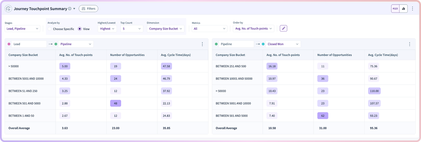
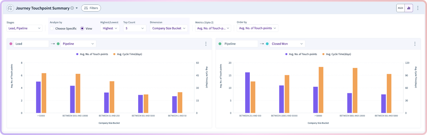
This new widget gives marketing and revenue teams a clear view of how users move through key funnel stage transitions like Visitor → Lead or Lead → MQL, using a combination of visual charts and easy-to-read tables. Instead of being forced to stitch insights together from multiple reports, you can now understand journey efficiency, touchpoint volume, and time-to-progress in one place, fast.
Why RevSure Journey Touchpoint Summary matters
Most teams track funnel stages as milestones, but what matters in the real world is the journey between those milestones. Two prospects might eventually become MQLs, but one could take 3 touchpoints over 4 days while the other takes 15 touchpoints over 6 weeks. Those are completely different stories, and they require completely different strategies.
RevSure Journey Touchpoint Summary fills that gap by making the in-between measurable and visible. It helps you move from “our conversion rate is down” to “this segment needs more touchpoints and takes longer to convert, which tells us our motion isn’t resonating.”
It’s built for teams that want answers to questions like: Are we seeing longer cycle times this quarter? Which segment requires more engagement to convert? Where are prospects getting stuck? And where are they moving smoothly so we can scale what’s working?
What you can learn from the widget
RevSure Journey Touchpoint Summary helps teams understand both the effort and the time involved in moving users through the funnel. It gives you visibility into touchpoint behavior and stage-to-stage dynamics, without having to manually pull data or run complex analysis.
Here are some of the most common insights teams uncover right away:
- How many touchpoints are typically needed to move users forward through a stage transition
- The average cycle time between funnel stages, so you can spot slowdowns early
- Where journeys are moving quickly and where they’re stalling
- Which segments show high-effort, low-return patterns (high touchpoints, long time-to-convert)
- Which cohorts convert efficiently, so you can prioritize and replicate what works
This is especially useful for marketing performance reviews, weekly pipeline discussions, and revenue planning, where teams often struggle to explain what’s driving the trends they’re seeing.
How it works: designed for fast exploration
We built RevSure Journey Touchpoint Summary to be instantly usable, even if you’re not an analyst. The experience starts with a clear entry point, then expands into deeper insights as you explore.
You begin by selecting an initial funnel stage. Think of this as choosing the starting point of the journey you want to analyze. From there, the widget generates a set of dynamic cards that break down key stage transitions and highlight the metrics that matter most.
Each card is designed to be both visual and actionable. You’ll see charts that reveal patterns at a glance, backed up by tables that make it easy to interpret and compare. Whether you’re looking for anomalies, consistent trends, or top-performing segments, the widget gives you multiple ways to understand the same story.
Because it’s interactive, you don’t need to rebuild reports or run new exports every time you want to ask a slightly different question. You can investigate, filter, and compare on the spot.
Built-in controls for slicing the journey
Journey behavior isn’t uniform. A motion that works well for mid-market customers may not work for enterprise. A fast journey for one segment can hide a slow journey for another. That’s why RevSure Journey Touchpoint Summary includes simple controls to help you break down results without complexity.
You can quickly toggle between views that highlight the highest and lowest values, making it easy to spot the extremes that deserve attention. For example, if you want to know where cycle time is longest, you can flip to “highest” and immediately see which segments are slowing down. Or if you want to understand what “good” looks like inside your funnel, you can flip to “lowest” and identify the journeys that move most efficiently.
You can also apply filters to explore how the journey changes by context, including categories such as:
- Account Segment
- Company Size
These filters make it easy to move from broad visibility to precise answers. Instead of debating whether a slowdown is real, you can see exactly where it’s happening and who it affects.
Visual charts + tables: a complete picture in one widget
One of the biggest problems in journey analysis is that teams often have to choose between visuals and numbers. Visuals are great for spotting trends, but they can hide nuance. Tables can show detail, but they’re hard to interpret quickly.
RevSure Journey Touchpoint Summary combines both.
Charts help you immediately see which stage transitions are healthy and which aren’t. Tables support deeper evaluation by showing touchpoint counts, average cycle times, and other key measures in a format that’s easy to scan, compare, and share.
The result is a widget that works for different audiences at the same time. A marketing leader can glance at the summary and spot a trend. A demand gen manager can dig into segments and identify what changed. A sales leader can understand whether pipeline velocity is improving, and why.
How marketing teams use RevSure Journey Touchpoint Summary
Marketing teams often have activity data, but the hard part is tying that activity to real funnel progression. RevSure Journey Touchpoint Summary makes that connection clear by showing what it takes to move a user forward and how long it takes to happen.
With this widget, marketing teams can more confidently answer questions like: Are leads taking longer to become MQLs? Are we over-engaging certain segments? Are we generating interest but failing to create movement? And which journey patterns suggest strong intent vs. low fit?
It’s also a powerful tool for identifying where to invest next. If a specific segment requires significantly more touchpoints than others to progress, that’s a signal to revisit messaging, offer strategy, channel mix, or nurture design. If cycle time is climbing month-over-month, it might indicate weakening product-market resonance or a mismatch in how prospects are being qualified.
How sales and revenue teams benefit too
RevSure Journey Touchpoint Summary isn’t just a marketing view; it’s a revenue alignment tool.
Sales teams often inherit pipeline that “looks fine” on paper but behaves unpredictably in practice. This widget helps sales leaders and SDR managers understand which segments are moving efficiently and which ones are taking longer than expected to convert.
That clarity supports smarter prioritization. If a segment consistently requires fewer touchpoints and progresses quickly, it may deserve faster follow-up or a dedicated motion. If another segment requires heavy engagement and long cycle times, it may require different qualification criteria, routing rules, or sales plays.
Most importantly, it gives sales and marketing a shared source of truth. Instead of debating lead quality based on anecdotes, teams can look at journey performance and see what’s actually happening.
—
RevSure Journey Touchpoint Summary is built to turn funnel movement into something you can actually see, understand, and improve. It brings structure to the messy middle of the funnel and helps teams uncover the journey patterns that drive real revenue outcomes. Book a quick demo to see it in action.